

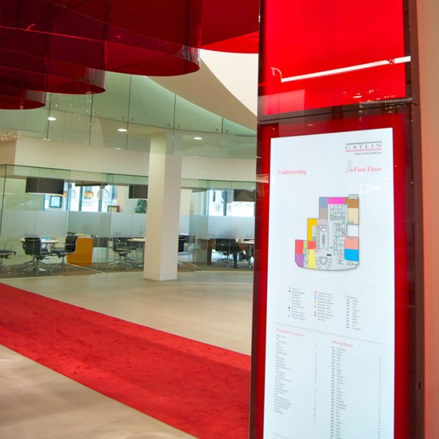
PROGRAMME SNAP SHOT– How do you take concept designs and a family of elegant sign ware, which we both simple and functionality. The brandware had incorporate a deep, translucent red colour that was used in architectural features throughout the building. Attention to detail and design commitment that was necessary to make this project a success.In particular, some of the rooms feature a ‘walk the line’ element, derived from Catlins marketing. Specially created icons that incorporated the continuous red line were created ensuing that they were in keeping with other marketing material. The signs had to be robust and self-supporting and had to be illuminated but also be maintainable and could be easily update.Detailed design exercise, developing functionality, investigating materials and producing a ‘look and feel prototype’ with consideration to the clients and building environmental policy commitments.Directories, Wall mounted directories, Free standing marketing totems Illuminated glass portal sign Bespoke manifestation signs the manifestation signs are as carefully designed and executed as other form an integral part of the branded environment.
SCOPE OF WORK – Survey and analysis I Project scoping I Bill of materials I Project Management I Concept design I Technical detailing I Budget development I Manufacture I Installation & close out.